


BEST GRAND SEIKO DIAL COLOURS AND STYLES:
WHICH COLLECTION TO CHOOSE
For many buyers, the dial is where Grand Seiko makes its strongest impression. It is often the detail that draws you in first, whether that is a soft white texture, a deep blue finish or a more understated black or silver dial. While Grand Seiko is known for movement innovation and case finishing, the dial is often what gives each watch its personality.
That is also why dial choice can be a useful way to navigate the collection. Certain colours and styles tend to sit more naturally within certain parts of the range. If you know whether you prefer something clean, expressive, traditional or more modern, it becomes much easier to understand where to start.
Why Grand Seiko dial choice matters
Grand Seiko dials are rarely just about colour. The finish, texture and way the surface reacts to light all shape the character of the watch.
Two blue dials, for example, can feel completely different depending on whether the effect is smooth and dress-led or highly textured and more dramatic.
This is where Grand Seiko becomes especially distinctive. The dial often does more than add colour. It sets the tone for the whole watch.

Black, Cream and Softer Neutrals: The Quieter Side Of The Range
Not every Grand Seiko dial is designed to stand out immediately. Black, cream, champagne and other softer neutrals offer a more understated route into the brand. These dials usually place more focus on clarity, proportion and finishing rather than visual texture or colour-led identity.
If that is what you prefer, Heritage and Elegance are usually the strongest collections to explore. Heritage keeps things clean and versatile, while Elegance moves further towards a softer, more traditional feel.
Seasonal colours and Textured Dials: Where Grand Seiko Becomes More Expressive
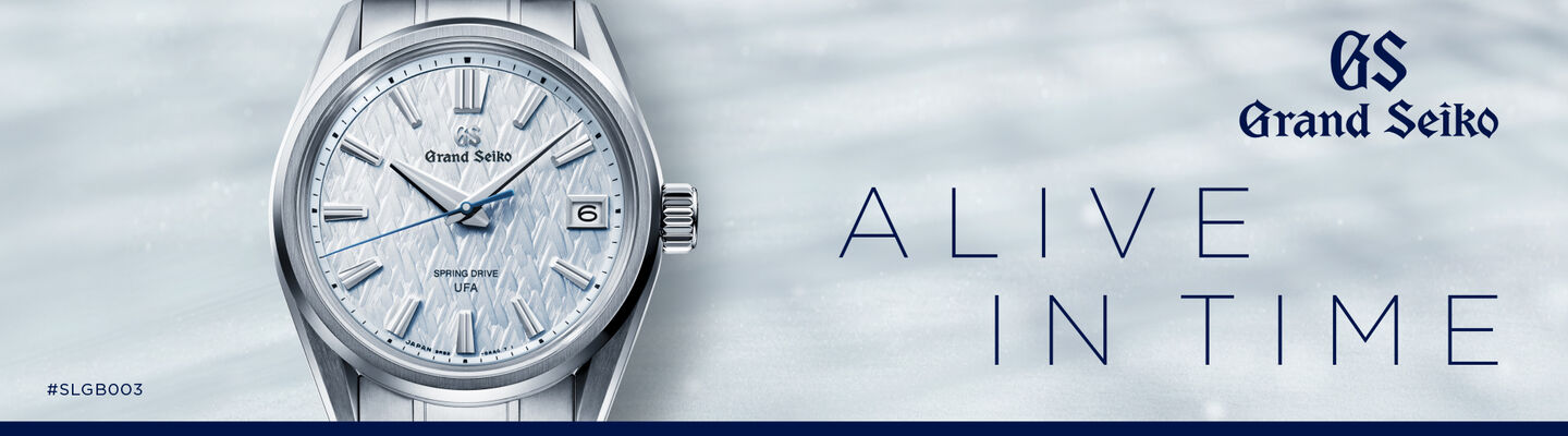
Some of Grand Seiko’s most memorable watches are the ones that lean more visibly into colour and texture. This is where the brand’s nature-inspired dials become more central to the design, with surfaces and tones that feel more atmospheric and immediately distinctive.
If you are drawn to this side of Grand Seiko, the choice often comes down to Heritage or Evolution 9. Heritage tends to present these dials through more classic case shapes and familiar brand signatures. Evolution 9 usually makes them feel more graphic, sharper and more modern overall.


White and Silver Dials: Clean, Bright and Recognisably Grand Seiko
White and silver dials are among the most recognisable in the Grand Seiko world. They tend to show the brand’s strengths very clearly, especially when paired with subtle texture and crisp finishing. These dials usually feel bright, refined and quietly distinctive rather than bold.
If this is the side of Grand Seiko that appeals most, Heritage is often the natural place to begin. It captures the clearest version of the brand’s core design language. If you like the same sense of clarity but want something sharper and more contemporary, Evolution 9 usually takes that look in a more modern direction.
Blue Dials: The Most Versatile Place to Start
Blue is one of the easiest Grand Seiko dial colours to wear, but it also appears in very different ways across the collections. Some blue dials feel soft and elegant, others cooler and more technical, while some are used to bring out texture and depth more dramatically.
That makes blue especially useful when choosing between collections. In Elegance, it often feels calmer and more classic. In Heritage, it tends to feel balanced and versatile. In Sport, it becomes bolder and more functional. In Evolution 9, blue often takes on a more striking, modern character.


Textured or Minimal: Which Style Suits You Better?
For some buyers, the real choice is not colour but texture.
A textured dial gives the watch more movement and variation throughout the day. It changes more noticeably in different light and tends to feel more characterful on the wrist. A cleaner dial creates a calmer effect. It usually feels more restrained, more formal and easier to wear in a very understated way.
If you like visible texture and light play, Heritage and Evolution 9 are often the best places to look. If you prefer a smoother, more classic feel, Elegance may be the better fit. Sport stands slightly apart, as its dial design is often shaped more by function and legibility than by refinement alone.
Which Grand Seiko collection should you choose by dial style?
If you prefer clean, bright and balanced dials, Heritage is often the clearest starting point. If you want something softer, dressier and more traditional, Elegance makes more sense. If you like stronger colours and a more functional feel, Sport is the better direction. If you are drawn to sharper textures and a more modern overall look, Evolution 9 is often the most natural fit.
Choosing a Grand Seiko by dial style is often more intuitive than choosing by movement or specification alone. The dial tells you a great deal about the overall character of the watch, from how restrained or expressive it feels to whether it leans more classical or more modern.
That is what makes dial choice such a useful way into the collection. Once you know what kind of surface, colour and light play appeals to you, the wider Grand Seiko range starts to make much more sense.
To understand the craft behind these details, read our guide to Grand Seiko dial finishing. If you are still comparing the main collections, our Grand Seiko Heritage, Elegance, Sport and Evolution 9 guide can help.